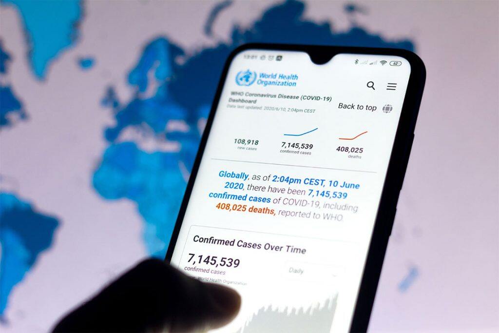
A new University of Toronto study finds that showing COVID-19 data in a particular way can influence how seriously people view the pandemic, which in turn can impact their behaviour.


The study, published in a COVID-19 edition of the Journal of Experimental Psychology, looked at two commonly used types of data: total case counts since the pandemic started and the number of new daily cases. Participants were shown one or the other and were asked to rate the current level of risk associated with the pandemic and how it would affect their behaviour, such as willingness to dine in restaurants or wear masks.
Researchers found that people viewed the pandemic as riskier – and more deserving of caution – when they were shown total case counts.
“Even a subtle difference in which data are shown can impact how risky people view the pandemic,” says Sam Maglio, associate professor in the department of management and co-author of the study.
Maglio says that daily case counts can vary but total case counts is an ever-increasing number – so seeing total case count makes people view the pandemic as more serious, which makes them less willing to engage in riskier behaviour.
“When you see a number that keeps rising, it goes without saying that it grabs your attention and makes you think about your own risk of infection,” he says.
Maglio says the findings suggest showing total case counts causes people to be more vigilant, but constantly doing so may be disingenuous. For example, if total case counts are shown at a time when daily case counts remain consistently low, the data isn’t painting a complete picture of the current state of the pandemic.
“If you’re only shown the total case counts, you’re not sensitive to the rate at which it’s fluctuating either up or down,” he says.
At the same time, when people are presented with high numbers (in the millions for COVID-19 cases), Maglio says the data can become abstract.
“If you repeatedly flash a number that’s in the millions, many people may not know what to do with it – they might be desensitized to it,” says Maglio.
He says an effective way to get people’s attention might be to show the total case count number along with a concrete example of an individual hospitalized with the infection.
What do the findings mean for those communicating data to the public?
For one, it shows how small, subtle interventions can change behaviour – and that greater care needs to be taken when presenting data. Maglio says not considering how a message will be interpreted is careless and does a disservice to audiences.
The findings also suggest there’s no neutral way to present data. Whether it’s visualizing data or communicating science to a wider audience, those presenting information are making decisions that can impact how the audience interprets the message.
“It’s important to be transparent with data,” Maglio says.
“If you’re only showing one side of the data, maybe direct your audience to where they can get all the data, or, at the very least, some guidance on what’s missing.”


